
HTML+CSS項目:520 表白紅心
來源我的學習筆記:
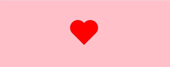
<!DOCTYPE html>
<html>
<head>
<meta charset="UTF-8">
<title>520confession</title>
<style type="text/css">
*{
margin: 0;
padding: 0;
}
body{
background: pink;
}
.box{
width: 120px;
height: 120px;
background: #FF0000;
/*rotate the box 45 degrees*/
transform: rotate(45deg) scale(0.85);
/*gave the box some margin*/
margin: 200px auto;
margin-bottom:80px ;
animation: love 1s infinite;
box-shadow: 0 0 20px rgba(255, 0, 0, 0, 0.7);
}
/*making a love shape*/
.box::before,
.box::after{
content:"" ;
/*adding abssolute posting*/
position: absolute;
width: 120px;
height: 120px;
background: #FF0000;
border-radius:50% ;
box-shadow: 0 0 20px rgba(255, 0, 0, 0, 0.7);
}
.box::before{
left: -68px;
}
.box::after{
top: -68px;
}
@keyframes? love{
0%{
transform: rotate(45deg) scale(0.85);
}
50%{
transform:rotate(45deg) scale(1);
}
100%{
transform: rotate(45deg) scale(0.85);
}
}
</style>
</head>
<body>
<div class="box"></div>
</body>
</html>
